Posts Tagged ‘art’
UPDATE: I’ve also included a pricepoint where you also receive a character sketch along with your poster. If you’ve already purchased a poster and want to upgrade, let me know (wiigii at gmail) and we’ll get it figured out.
Newwwww product!
My wife and I don’t get to vacation a lot. Sure, I’m on the road all the time for conventions, but usually by myself and to always to make a living, since this webcomic is my job. So I figgered, you know what, I will make an awesome poster and put the proceeds into the Willis Vacation Fund. Best case scenario, we’d raise enough quick enough to put in for a room for the second JoCo Cruise Crazy, which Joel Watson of Hijinks Ensue would reaaally like because he and his wife are going and he needs me around to help introduce him to famous people like Wil Wheaton, but rooms are dwindling, time is short, and, really, Maggie and I just need to get out there anywhere this coming spring. If we don’t JoCo, that’s regrettable, but the Getting Away is what’s really important. Actually I have just been alerted by Joel that if I don’t go to JoCo with him, I will be murdered. All right. Well, folks, that’s on you, apparently.
And so we have this awesome artwork of the denizens of Dumbing of Age cheering at one of their university’s football games! Most of everyone’s favorites are there, plus a few I wanted to make sure appeared in a poster who hadn’t yet managed, like Danny, Amber, Mike, and Ethan. (I’m not sure who my favorite character in this particular artwork is, since I have to choose between Mike’s interesting spirit-wear choice, Walky’s toplessness, and Dina’s giant foam pointer.) You can see progress shots of the artwork on my Tumblr, and the original suggestion for the theme was offered here by crazymusician320.
You can get the poster mailed to you for the fund-raising price of $20, which includes shipping within the United States, or for half that you can choose to be mailed a URL where you can download the art at desktop wallpaper size. (I’m thinking 1280px across, but if I’m wrong in that estimation, let me know. Easiest thing to accommodate.) These are signed and numbered 1 through 100! The poster will be mailed after Christmas.
Thank you for your consideration! If you want to contribute to our vacation fund, that is great. And if you don’t want to or you can’t, that is also great. I’m just happy you’re on my site reading my stuff.
(Oh, and since when I asked for poster ideas, folks kept on suggesting “beach” or “swimsuits,” I should probably mention the “Monroe Lake” poster which has been around for a while.)
(Oh oh oh, and apparently I can’t shut off postage fees for the wallpaper option, so if you’re from outside the United States, I’ll have to manually refund you that $3. Grargh.)
This is my earliest art of Dorothy. I think I designed her as I drew her the first time for her first appearance. Not something you should be doing, but it happens sometimes.
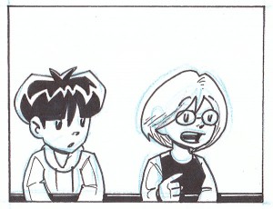
This is a panel from Joyce & Walky!‘s subscription strips, so it’s not something I can link you, sadly. The panel depicts Walky and Dorothy in high school together. (This, of course, never happened in Dumbing of Age.)
Let’s party!
We should gather and remember our favorite moments from Dumbing of Age past. Remember Sunday? And Monday? How about Tuesday? And can you believe Wednesday? Wow. And let’s not even get into Thursday. And, jeez, Friday is still going?
What a roller coaster ride. Those were some good times.
May we all live to see Saturday.
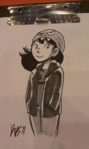
This required some digging, but here’s my first drawing of both Dumbing of Age Robin and Leslie, which I believe I drew while at Animefest in Dallas last year, the week or so before Dumbing of Age premiered. So this drawing’s almost exactly one year old!
I finally get to, you know, show it, now that somebody’s out of the bag.
Congresswoman Robin DeSanto in today’s strip is drawn from my memory of this sketch, and so I’d forgotten that I’d drawn her with her hair down and had given her a dress shirt and tie. Eh, no big. I like what I ended up with.
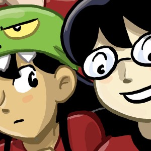
Republished image to help inform the poll on the right
by David M Willis on August 1, 2011 at 10:43 pmSome wallpaper featuring folks you probably don’t care about.
by David M Willis on June 26, 2011 at 9:34 pmI’ve spent the weekend designing some crowd filler characters, and I’ve made a quick wallpaper of them. You can find it on my Tumblr.
 Sarah’s out of the top image. It makes me very sad. I have big plans for her, but all of these plans stem from her being avoidant and generally anti-people. And having her interact with everyone all the time right off the bat works against that idea, so there hasn’t been very much of her so far.
Regrettably, since she’s one of my favorites.
Meanwhile, I figgered I should have the actual top three DoA characters ranked by number of appearances up in the header. That, at the moment, has Joyce waaaaaaaaaaaaaaay in the lead, with everyone else sort of gathered around the middle battling for second and third place. Joe and Billie take that honor, respectively. Look at the tag cloud down in the lower left to see for yourselves. I think I might start swapping out the people up top as they jostle for position. (Man, this storyline has a lot of Dorothy. She has a real shot of getting up there in a month or so.)
In the meantime, a minor goal of mine is to get Sarah earning her place at the top again. Unfortunately, Sarah won’t like it.
Here’s something I’ve decided to crosspost from my DeviantArt:
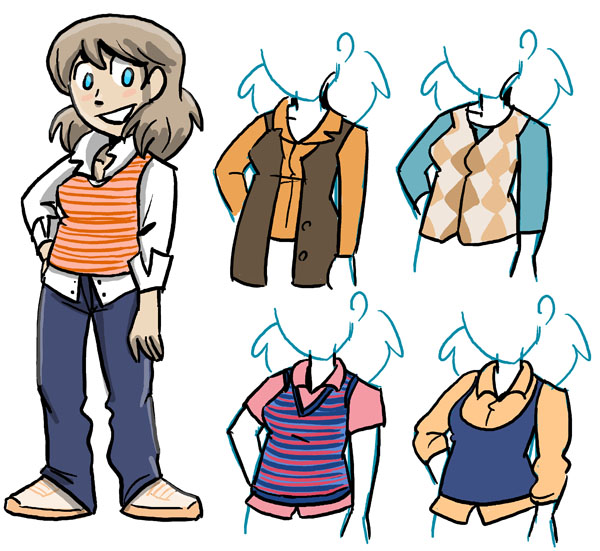
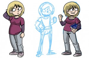
So I’m thinking, man, my original model sheet for Dumbing of Age‘s Dorothy doesn’t really cut it anymore, but didn’t I draw it just — oh my Lord, that art is ten months old already! Whoa, how time flies.
Dorothy got redrawn. I’m not sure exactly what for, other than to satisfy myself, as it’s not like Dorothy’s full-body art is all over my website or anything. It was an itch I needed to scratch.
More important than representing the little nips and tucks she’s accumulated over the past year is her expression and posture. When I drew the first Dorothy, what was most prominent about her to me was “She Wants To Dump Danny But Hasn’t Worked Up The Courage Yet,” and so her pensive, almost sad look made sense at the time. But that’s not really what Dorothy’s about, and it certainly hasn’t been what she’s been about since about October! I wanted a bit more of the gung-ho, studious Dorothy. So now she’s standing up right, smiling, and holding a book.
The unfinished sketch in the middle had a more interesting pose, I think, but I didn’t like her head being down and her posture needed to be more defiant, so I started over with the finished version on the right.
Physical things that seem to have changed: Head’s smaller. Body’s thinner. Her clothes fit. Dropped coloring the lower lip at some point.


