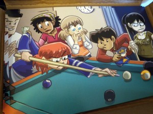
I’ve got one more convention this year, New England Webcomics Weekend (November 6-7), and I wanted to make sure I had some Dumbing of Age mechandise. Well, there ain’t enough comics yet to fill a book, so I went the art direction instead. I’ve done art before — in fact, “limited prints” were how I made a living about a decade ago — but I wanted to try something a little nicer this go-round. When I was a young webcomic upstart, I printed out my stuff at, y’know, Kinko’s. (Youngsters may now know this fabled place as “FedEx Office.”)
So check this out. I ordered them online a week or so back from a very nice place that is not Kinko’s, and they arrived today. 17″x11″ artwork printed out on card stock gloss. It’s amazingly nice. I am serious. It’s as nice as my artwork can possibly look! They’re so nice that I kinda want to frame one myself, but man that’d be kinda douchey.
If you want an unobstructed-by-afternoon-lighting look at the artwork, click on through here to my DeviantArt account. And to own it, it’s available in the Shortpacked! Store! for $15 and shipping. It’ll come to your mailbox nicely rolled up in a tube.
Did you know I started out ten years ago selling limited prints for $25? And now they’re ten bucks less, twice as big, and a hojillion times better quality. Progress is grand!


Hey, David, if you don’t mind me asking, where’d you get these printed at?
http://www.digitalroom.com/ I’m super impressed with their quality.
Thanks, David. I’ll check into them for some of my comic related stuff.
Thanks too David, I think I may go with your recommendation for where to get prints done =)
There is absolutely nothing wrong with framing your own artwork in your own house that you’re proud of. If I had more liquid cash I’d buy one and demand you put it up instead of sending it.
However, my wife would ask me why the hell I would do that and remind me that you’re an adult and can make your own decisions.
Oh well. Yes, they do look nice!
If I wasn’t a broke-ass college student, I’d buy one right now.
Does the store look funky to anyone else? I’ve got a large black block above the first two prints (Shortpacked! Books 2 & 3) with two red links inside the black. (“limited prints” and “give them to me”)
I disabled ad-blocking and refresed, but I still see it.
I don’t see those, no. But I wouldn’t be surprised if you could. That page is a mess! A better e-storefront is on my shortlist.
(Your order went through, by the way.)
Ah, okay. Above the first two *books*, you mean. That’s a green background on my screen. Probably a difference in browser, then, since that page is tabled to hell.
Ah, I just “drag selected” across the black area and I see there is actual text in there. While the background of the page is green, the items for sale have a thick black border that includes that text block. Black text on black background. (if the links weren’t a different color, I wouldn’t have known they were there)
As the long as the order went through, all is good!
That’s all moot now, ‘cuz woo new storefront: http://shortpacked.bigcartel.com/
Is Ruth wearing a Leafs jersey? Awesome!
As someone who has their own artwork framed and up on the wall, I insist it isn’t a total douche-canoe kind of move.
At the very least, it’s fiscally efficient decorating. HGTV does whole segments on how non-artists can make their own art to hang on their walls! EVERYBODY’S DOING IT, MAN.
(Also, if I spend 15 fucking hours on a charcoal piece, that son of a bongo is going on the wall.)
Makes me wish I were able to travel to this convention. Alas for boarding school and lack of transportation. I hope everyone that goes has a great time and posts some stories on the web.
Ruth is holding her queue in a terrible manner. Er, is that intentional to imply that she’s a rubbish pool player for some reason?
(Also, is it me, or are Billie’s boobs huge here?)
What part is wrong? I studied a lot of photographs to make sure I got it right.
And Billie has always had an impressive rack. So to speak. Frankly, they’re a little smaller than usual.
I don’t know if it’s different in the US (although I can’t see why it would be), but putting your index finger over the top of the cue is a very bad habit. You’re supposed to rest the front of the cue between the thumb and the first finger.
http://www.livestrong.com/article/196650-how-do-i-hold-a-pool-stick/
(Granted, they do say on that site that doing the “OK” thing with your finger is an alternative. In my limited experience of pool halls though, no-one would do that. But, as I said, maybe pool standards are different in the US.
Pool cue. That’s what I meant.