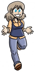
 Enjoy some additional Joyce art. I realized I wasn’t really satisfied with the original stock Joyce artwork (the one that’s shown next to her assortment of sweater vests), and so I was driven to create a new one. That original DoA Joyce art was drawn in, like, July, anyway, so I think I’m allowed to hate it by now.
This is what being an artist is like. Constantly hating your older work. And the turnover rate is astounding!


Joyce looks pregnant. Is there something you’re not telling us?
Pretty sure that’s just her puffy tanktop/sweater/vest
That was the joke, thanks.
I’ve found this to be a pretty good analogy for the whole “my art looks bad in hindsight” issue: http://sodiumeyes.com/2008/12/15/the-road/
I constantly hate my old work, usually when I’m done drawing it.
Joyce is looking cute, as usual.
I love Joyce’s design! Especially how her eyes are different from everyone else’s. She’s always cute, too. I wish I could say I were an artist and say, “My old stuff sucks too!” but I have never been good at drawing. I sing, though…even though I hate listening to myself.
“You’re your own worst critic.”
The weird thing is that Joyce is getting older through the images, until the last one where she loses about a decade in age.
Have you made any deliberate design changes to make the cast look younger than the J&W-era stuff? Walky seems to look younger, but I can’t quite work out why.
Walky loses years, I think, due to his body language. It’s all posture.
As for everyone else, there’s very small proportional differences here and there, but nothing I could really quantify. My style isn’t detailed enough to really age someone between the ages of 18 and 35.