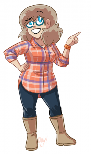
 Every time I’m like “okay, no more plaid, don’t do a character in plaid again,” and every time I still end up finding reference for a plaid shirt that’ll make me go “oh that’ll look great on so-and-so” and whoops anyway here’s Joyce in plaid for this storyline. And a weirder pattern, too! Those thicker blue lines are irregular! What am I doing? I have 5-year-old twins! I don’t have time for this!
Anyway I’m told I need to write more blogs on this site, for the SEO, so that’s part of why I’m parading this art in front of you and blathering on about it. Also, I drew plaid, so APPRECIATE.
Though when it did come time to render the shirt day-to-day in the actual strip, I sure dropped the angled variation of the pattern on the pocket. Look, I have to set some boundaries for myself.


That is some epic plaid rendering. Also, as parent to a solo high energy five year old I have massive respect for any folks with twins.
Some sort of moderately excessive cheering on phrase goes here but I’ve hit word soup o’clock so this will have to do
Plaid Button-Down Appreciators Anonymous salutes you for your sacrifice.
o7
(Seriously she looks great. The angled stripes on the pocket would just get lost in translation anyway; I for one didn’t notice the difference until you pointed it out.)
“Though when it did come time to render the shirt day-to-day in the actual strip, I sure dropped the angled variation of the pattern on the pocket. Look, I have to set some boundaries for myself.”
And thus begins the downward spiral…
There was supposed to be a parenthetic *grin* at the end of that …. wha’ hoppened?
Honestly did really appreciate the color scheme of the plaid shirt even before this was posted. I want this plaid shirt. Also, it really fits Joyce’s new “glasses” look ahaha
SEO is important, Willis.
Anyway, if you need a help from some of your sites, I work with websites since 10 years ago.
If clockwork regular daily updates aren’t sufficient for SEO, and you need fresh words on your front page why not offload some of the work onto your fans? Embed 1-a few random comments from the day’s discussion onto the front page below the comic-blog entry. If they’re randomly selected, then even offensive ones (do those really show up in this crowd?) would only appear for an individual given view.
“I sure dropped the angled variation of the pattern on the pocket”
You… you mean you chose to take our attention away from her boob? I’m… I’m genuinely gobsmacked.
OK, fine, I know you’re an ass man. But still.
This is elite level plaid rendering! It has contours! I’m more used to seeing a kind of unshaped plaid “fill.” Just a solid slab of right-angled lines going over sleeves and torso like the wearer was 2D… yet somehow it works. Sometimes it’s done with a fill tool, but I remember a hand-drawn example in “Love and Rockets.”
You just gave me a flashback to Tiny Plaid Ninjas.
https://m.youtube.com/watch?v=rZccIAg_N2Q
honestly, this thing where Joyce does genuine, non-performative processing with Joe is a thing I enjoy.
I mean, the sheer fact this isn’t Immovable Plaid (ie. the plaid actually flows with the fabric) is impressive enough.