So the other day I was all like, oh, huh, you can animate in Photoshop, and then I went mad with power.
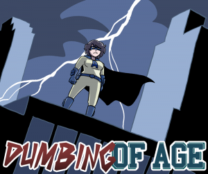
You’ll probably have to click on these to see their full glory. Oh, and here’s a screencap of the Amazi-Girl ad at a larger size, before I shrink it down:
(Update: Apparently WordPress adds this image into the gallery whether I want it to be or not. So, uh, don’t try to get the one up above to do anything.)








One glorious step closer to the Dumbing of Age television show (airing on Cartoon Network, 2015.)
Your avatar here is perfect. But personally, I think it would be better on Adult Swim than regular ol’ CN.
There is no way they would allow Roz with her condom hat on normal primetime CN.
The Dina and Amazi-Girl ones are great (especially Dina… omg, the cute), but I find the Joyce one kind of annoying. There doesn’t really seem to be any point to the animation on that one, so having Joyce bouncing around in the sidebar of something I’m trying to look at is just irritatingly distracting. (I ran into her in the wild… yesterday, I think it was, on Between Failures.)
I saw Joyce bouncing and instantly wondered what (or who) she was sitting on. I think I’m a bad person.
I hope not. Because I had the same thought.
Question; would it be rude to use the amazi-girl image online if the “dumbing of age” was removed, but replaced at the bottom of the image but smaller?
I don’t understand the Joyce one. Why is she bouncing? But I love love love the Amazi-Girl and lightning.
The Dina ad is beautiful.
Awesome